DESIGNER / THINKER / MAKER
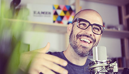
I design search at Google and Music at YouTube. I try to share what I'm learning by producing videos, giving talks, recording podcasts, & making music.
I design search at Google and Music at YouTube. I try to share what I'm learning by producing videos, giving talks, recording podcasts, & making music.